
001 GOOD NEIGHBORS
LIVE CONVERSATION: ROB SULLIVAN AND LISELOTT JOHNSSON
recorded on
www.facebook.com/LOLWOWSOS/
September 14, 2019
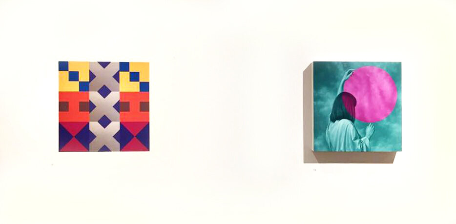
Invitation to artists Robert Sullivan and Liselott Johnsson to converse about their two works exhibited side by side during the Flagship Exhibition at Van Dernoot Gallery, University Hall, Lesley University, Cambridge, MA, USA, earlier this summer.
Liselott Johnsson: Thank you for the invitation. Would love to have a conversation with fellow painter Rob Sullivan about these two works. The juxtaposition is not only aesthetically pleasing, but also fascinating and very funny. I would appreciate knowing how you, Robert, perceive these two works side by side. Humor is derived from play and has the ability to allow the principle of reality and the principle of pleasure to coexist. It has the ability to reconcile opposites and, like art, exists in a dimension of illusion. Humor makes my work as an artist more entertaining and it has a fascinating ability to draw a viewer in, almost in a physical way. Once the joke is understood, the viewer tends to feel part of the work. I find that humor is a very powerful tool but that it has to be used wisely. It can be so destabilizing that it actually destroys the meaning of the artwork itself. One doesn’t want a viewer to laugh at the work but rather with it, being complicit. Would love to know if you have any thoughts about the humor expressed by these two works exhibited side by side!
Rob Sullivan: I’m going to take a more academic tack and look at both the formal and interpretive properties of these in these pieces side by side.
Formally, both works adhere to a “code” of color, which is at once somewhat minimal, yet calls to mind color theory and design principles. Your high modernist design seems at odds with my representationally real rendering, yet both — through similar motifs — draw attention to flatness of surface. My piece strives to achieve depth (even the panel’s dimensional presence looks to bolster this), but the 2-D sphere interrupts the idea, breaking a variety of spatial planes. Yours goes full bore, not only being a flat, printed sheet, it is also mounted directly to the wall, eschewing physical depth completely. I believe this puts the posterization and immediacy of the symbols in a space of utter clarity. In summary: both works rely on precise optics that have very different delivery systems, yet end up with oddly similar formal outcomes.
RS: An interpretive analysis finds both works in another “same, but different” situation. Your piece, due to the repeated design symbols, reads as code. The specific arrangement asks to be “read,” though the viewer initially has not yet discovered how, but the invitation to discovery is clear. Mine, however, due to the representational realism, gets read immediately: there is a female figure in a robe, gesturing in front of a sky, and there is a circle within the gesture … sort of. It is, of course, the 2-D aspect of the circle that brings on the “sort of,” and invites further questioning. And then, the viewer looks (perhaps for a second time) at the titles. Yours is, “LOL/WOW/SOS.” This, of course, is the clue to the code. The title is the work, essentially. It is clever, and it is funny. Yet, the high modernist aesthetic shows a higher sensibility than just a puzzle. The stylization of symbology also invokes nautical flags and pictograms and the like. It’s simplicity also recalls texting, and that revolves back around to the title and the typical abbreviations used when responding via text. (Humorously, I note that SOS may be a cry for help, but perhaps it’s this epoch of texting and its reductive linguistics that need a bit of assistance.) When the title of my painting, “Invoca” is read, it becomes a meta-narrative in that “invoke” is synonymous with suggestion. And, despite the representational directness of the work, much is suggested AWAY from said directness by the strange addition of the transparent magenta circle in a complementary field of viridian. However, “invoke” also means to enchant, call, or cast a spell. The figure seems to be gesturing in some kind of general way that could be interpreted as a magical gesture, and the circle that appears is part of the incantation. But because of its flat spatial relationship to the scene, it is not part of the scene … is it? If anything, I may have invoked confusion and questioning in the viewer. And that’s kind of funny.
LJ: Thank you Robert for your illuminating and apt response! I would appreciate knowing the materials (type of paint and support) and the tools (type of brush) you used to produce this work.
RS: "Invoca" is oil on cradled birch panel, 12 x 12 in. I used Gamblin oils with walnut oil as the medium. The support is primed with a shellac. My brushes are varied and old, like good boots that have shaped to your feet over time. The signage has worn off their handles, but I know a few of them are Winsor & Newton "Signet" brushes, as well as some Grumbacher synthetic orange sables.
LJ: Thanks for engaging in this conversation Rob. I agree with your reading concerning the colors, flatness of the images, the spatial depth, and the presence of codes. However, the use and the purpose of the color, even though equally seductive in both works, are distinctly different. I agree with Donald Judd’s statement: “Color is like material ... it alone is not art.” Yet, as soon as color enters in relation to anything, meaning is formed in the mind of the viewer. Color has the capacity to remove or alter the boundary of painting by establishing relationships with objects, sculpture, architecture, and society. In the “Invoca,” the uniform overall green-blue veil appears as a veil between the viewer and the painting, or as a veil between the painter and the model. In addition, the magenta circle looks as if applied or projected onto the image. The strange application of the color, and the empty space around the model, gives me the feeling that the oeuvre is a “mise-en-scène,” a consciously manipulated enactment (visibly influenced by symbolist vocabulary). Also, the selection of the materials of the work, shellac (already used as an artist material in 12th-century Spain and derived from insects), oil paint (perfected by Van Eyck in the 15th century) on wood panel (15th century) hints at this. It is an object that tries really hard to appear as a painting belonging to an earlier period and, as the glazing technique reveals, to the long tradition of Beaux-Art painting.
The absurdity and humor come from the viridian green and the magenta, pigments that I read as synthetic and modern (synthetic pigments were developed in the late 19th and early 20th century). So, for me, the juxtaposition of 16th-century art materials and 20th-century pigments evoke a timeline. Could it be that the work actually speaks about the history of painting and the traumatic events painting has gone through and survived from the 15th century until now? The most traumatic of these events were the 20th-century confrontation with photography and now, as of late, the confrontation with photo editing software and the almost mandatory conversion of any painting into digital form.
So, using this logic, I read as if the image, because of the strange, almost liquid green color, was created in an artificial world, in the computerized and technical world. The image, though realistic-looking, could have been derived from a series of technical manipulations. Further, I understand the magenta circle as either a projection (projection of the digital image onto the support before painting) or as the symbol of the camera lens. The flatness of the paint and the shallow pictorial depth also recalls this relationship with photography and digital imagery. The work also speaks about the relationship between the master painter and his model as muse, a type of liaison that doesn’t seem to have a place in today’s world. In a strange way, it seems as if the model is artificial or not real, there is no place for the master painter either … Would love to know your opinion of this reading of your work …
Similarly, in the same transitive vein, the colors, patterns, and materials of LOL/WOW/SOS tell another story about painting. Here, it is the state of abstract geometric painting that is examined. The body of work, which LOL/WOW/SOS belongs to, explores the notion that color and pattern can become a code or a linguistic system. The work highlights the often, overlooked visual systems and codes that dominate our daily lives. The work can be appreciated only for its aesthetic qualities, but comes alive when decoded using my invented visual alphabet entitled: High Modernist Color Barcode. This substitution code emerges from the patterns of hard-edge abstraction, the Marine International Code of Signals, and the High Capacity Color Barcode, a type of two-dimensional bar code developed by Microsoft. In addition, the code integrates pictorial language of traffic signs, emergency safety objects, and fashion. In this group exhibition, the code was not provided, so the title (the solution) is displayed next to the work. The text is the work, the work is the text, which I agree, can be very funny. Sometimes questionable words look fantastic and I struggle with what words to exhibit … if I don’t watch out it can get very strange, very quickly!
LJ: Through the use of the High Modernist Color Barcode, I attempt to bring back hard-edge abstraction and geometric painting into the realm of art. Obviously, after this painting language has been employed for various serious and not-so-serious commercial purposes in daily life, it is no longer the same, and this is reflected in my choice of the materials and painting techniques. The powerful language of abstract geometric painting, once a symbol of the utopian and heroic ideals of modernism, has been so used for various purposes that it has lost its original meaning. By using a system to generate the artwork, I have distanced myself from the creative process. The work generates itself and it speaks for itself, I am only present to help it interact with the viewers and the spaces where it is displayed. This many times leads to humorous and awkward situations that keep on surprising me and make me laugh, both in the studio and when I exhibit the work ...
RS: Liselott, this is wonderful, and your assessment of my work in an art-historical context is spot on. I have spoken to my own work in this way, though your way of putting it is a refreshing perspective, nonetheless. You literally checked off all the bullet points in that area (including the relationship to photography and digital processes), which is extremely prescient, though your astuteness does not surprise me. And, as truthful as these elements may be, they are yet another layer factored into works that I’ve crafted to invite multiple vectors of meaning. Same as your self-assessment: the histories about which you speak and to which your own work relates are known to me as a fellow painter. This, too, broadens the scope of our respective works, both honoring and questioning the necessity (or lack thereof) of painting in this epoch. In terms of humor, the meta-awareness extant in the work serves as a foundation for our respective, amusing takes on the medium and respective genres.
An aside: I believe conversations such as this are edifying to a lot of folks who cannot bridge the gap between modernist and representational painting — not to mention those academics that scoff at 21st-century painting as a viable art medium. Perhaps further discussions and comparisons of this ilk are something to continue doing in the future?
LJ: Great, I am glad that my reading wasn’t too far off. It has been rewarding exchanging ideas with you. I agree, we should consider doing other comparisons of this sort in the future. Many thanks for your participation. Have a good opening at Melanie Carr Gallery tonight!
To learn more about Rob Sullivan’s art you are welcome to visit: